With a good website design and development company, it only takes a few small tweaks to make the best out of your web presence. Let’s explain how web design can improve your conversions.
How web design improves conversions is incredibly intuitive. However, you don’t get long to get the users attention and to help them find what they are looking for. Making the user experience as enjoyable and technically effective is what truly distinguishes a good website design and development company from, well, the bad ones! Here are a few tips for things to try to improve website conversions.
Making the most of your contact form thank you or order confirmation page
They have already taken the first step in contacting/buying from you, so why not take the opportunity here to offer some sort of referral incentive, social share link, or link to more relevant content on your site?
Change the colour of your call to action buttons

A/B testing is a good way of seeing if subtle changes to your site have an effect on conversion rates.
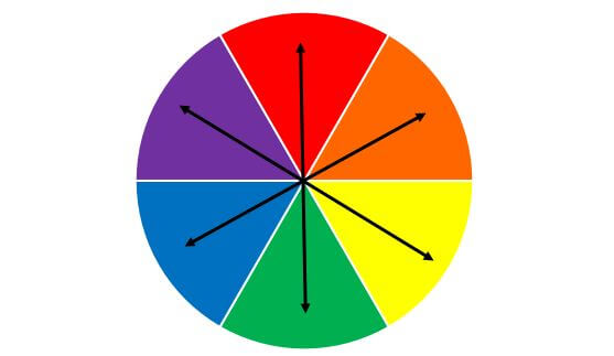
Using a complementary colour on your call to actions to your primary colour scheme can help to make them stand out to the site user. For example, make the Buy Now or Contact Us buttons stand out.
Many tests have been carried out to ascertain whether red buttons work better than green buttons – red is very much a warning colour which will instantly grab people’s attention, whereas green, often linked with Go! Can be seen as a positive colour. Try both options to see if it helps to improve website conversions.
The rule of thirds
The rule of thirds is often related to photography – it’s a means by which the composition of a good photographic image is based. Imagine an image divided into thirds horizontally and vertically, creating a grid of 9 images. All the key visual elements should be placed on these grid lines to help them catch the eye.
K.I.S.S. – Keep it Simple, Stupid!
Just like a bad joke, if you need to explain it, it doesn’t work. Keeping things easy to find, with clear calls to action will improve your website conversion rate and reduce the bounce rate, giving you more of a chance of capturing those leads.
Hicks Law
Related to the above point on simplicity, Hicks Law is a theory named after psychologist William Edmund Hick, which suggests that the time it takes for someone to make a decision is directly proportionate to the possible choices presented to them.
So, in other words, the more options on your website page, the longer the decision-making time becomes. Don’t overdo the call to actions!
If you would to know more about working with Red Sentence on your next web project, take a look at our guide on getting started with your website, and give us a call for a chat? hello@redsentence.co.uk / 01483 904950


