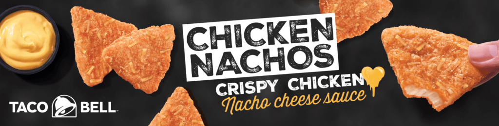
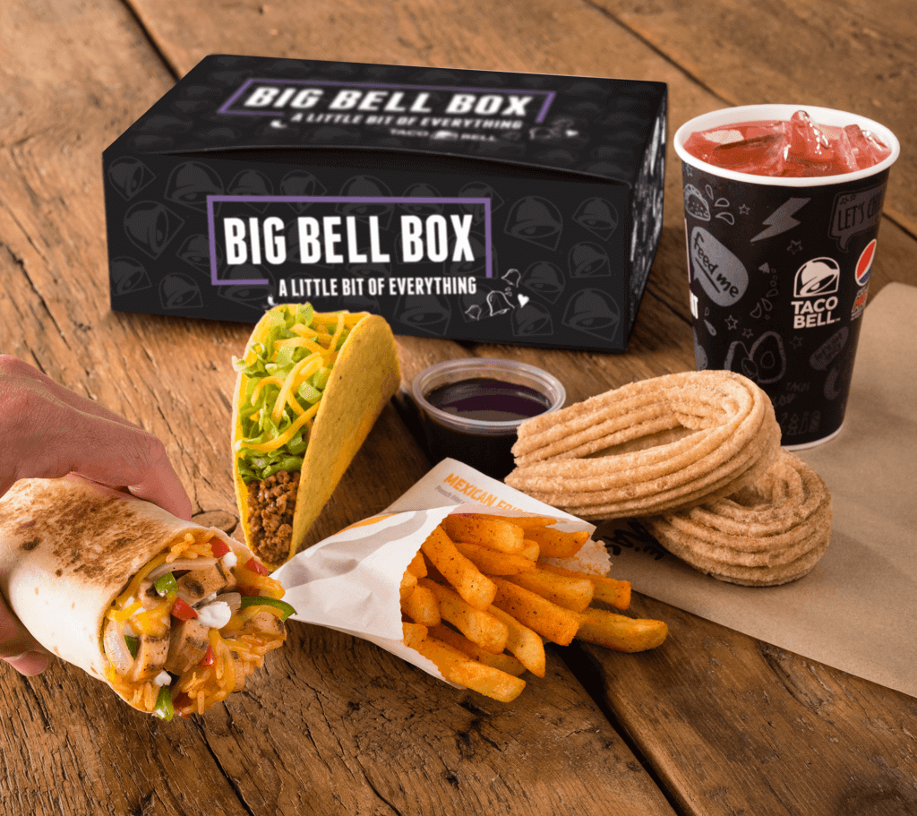
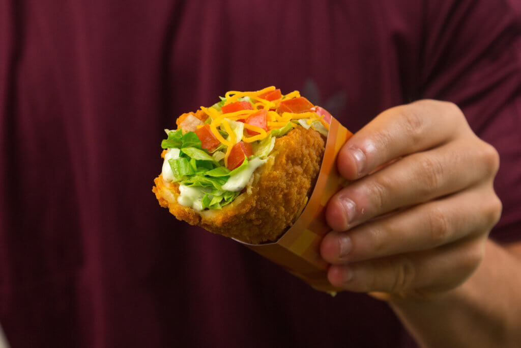
Graphic design: advertising campaigns
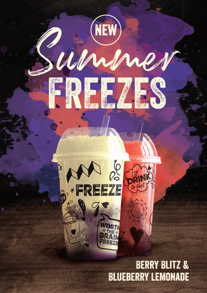
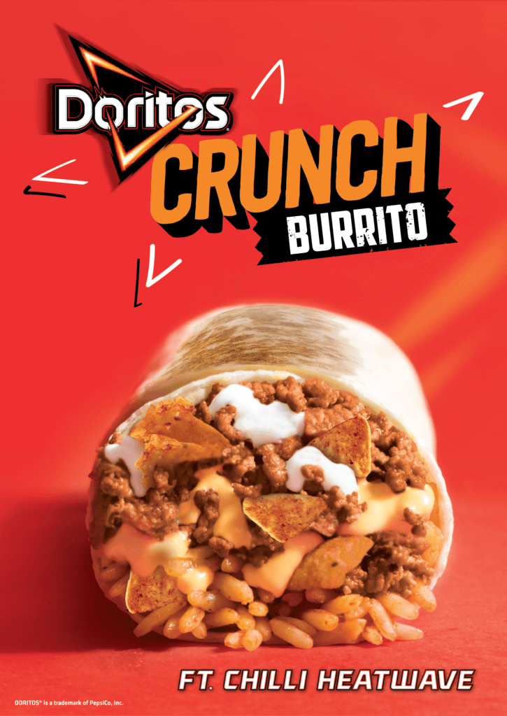
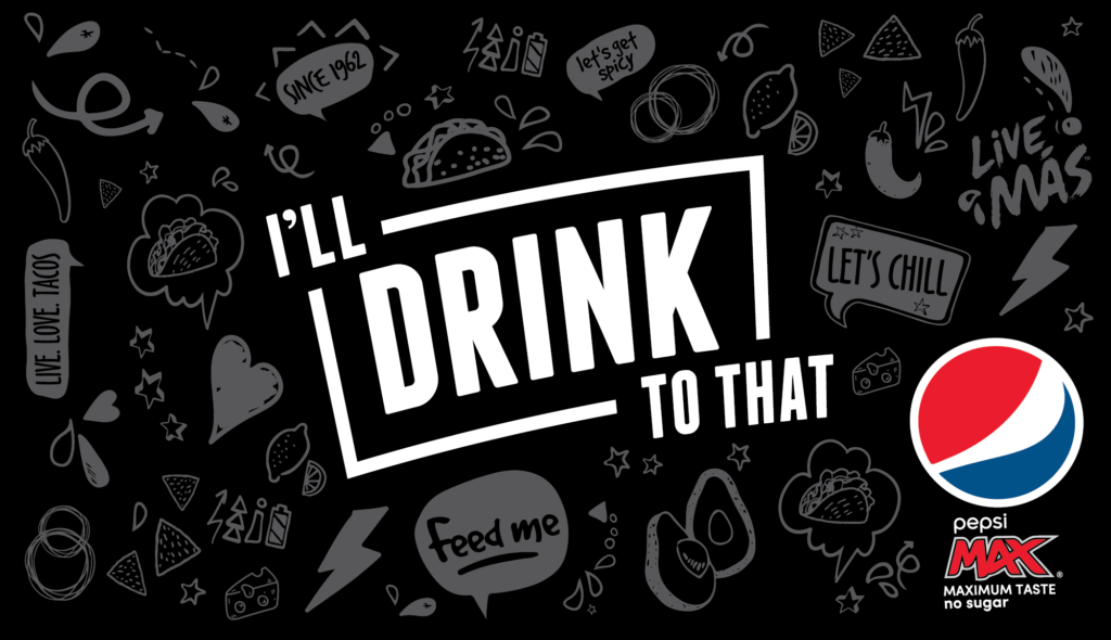
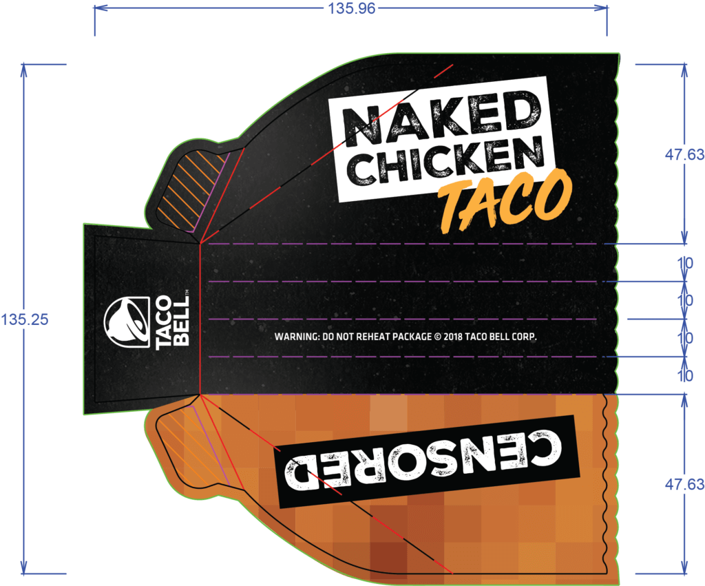
We design and artwork new product campaigns for Taco Bell, starting from designing the initial concepts through to then rolling the design out across all in-store signage and OOH media. This can be from flyers and magazine adverts through to phone boxes, bus sides and billboards.
We were delighted to be asked to design and develop a new logo for Taco Bell, as the UK team had been granted special permission to create a customised logo to coincide with stores opening in the capital.
Our brief was to create a logo which was fun, vibrant and iconic to London. We wanted to incorporate the Union Jack yet have a simplistic, stylish look.
We then went on to create an OOH teaser and reveal campaign, customer T-shirts, staff uniforms and store window hoardings.
Red Sentence are a great, small agency to work with. The quality of work has been fantastic, the team are friendly, prompt and have a great eye.
Ellen, Taco Bell UK & Europe